Cover:
Masthead: The first thing people look for on a magazine is the mast head, as my genre was indie i wanted to create something unique and related to music as this was the main aspect of my magazine. When i constructed my draft cover i used the name "awkward" as it fitted in with teenage life of choosing a group to be with. However after feedback i chose to use another name. After research i came across the musical term Octave, which i loved and it was related to music. So i used this instead. i feel the name attracts my genre as it is unique and no other magazine uses this. When designing the mast head i wanted to use a similar colour scheme to Q magazine however i didn't want to use the square they had used as i felt this wouldn't be unique enough for my genre. So i took the idea of the red as i felt this was eye catching to the audience. Seeing it put into practice by Q magazine i knew it would work.

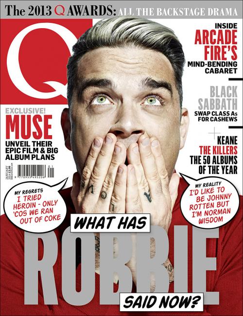
Main image/ model: The model i used on my front cover are of similar style to the genre i have selected to create my magazine for. My target audience would be interested straight away in regards to her style and type of genre of music. This would add a unique selling point as 'Leading Edge' genre would be interested in as they can read fashion trends for their style. When i came to taking the photos i printed out a series of poses used on Q magazines front cover and asked my model to pose in this way. I wanted to use a similar pose to what Robbies edition used. The model is seen facing forward making eye contact with the reader. This invites the audience in to read the magazine and is also aesthetically pleasing. I used a plain background behind the model as this would make her the main focus on the cover and not the background.

Cover Lines: I kept the idea of using the Q magazine colour scheme for my cover lines. I did this as i knew it already worked and the colours selected would catch peoples eyes when walking past the magazine stand. I looked at magazines already out there to get an idea where to place them and what to actually write. I chose to use the Exclusive cover line and this would intrigue the reader, as it is exclusive to Octave magazine. I chose to feature a cover line of my band/ artist 'Artificial Paradise' 'Naomi Edmonds' in red and white. The red contrasts to the black jacket, as does the white. Therefore bringing the readers eyes to this focal point. By putting the band name in a bigger font then the rest of the cover lines this will drew the reader in as the genre is indie and they want to look for new artists and bands all the time.
Contents: For my contents page i chose to use the same model as i want the band to be the main focus of the magazine as they are new and upcoming. Again i chose to use Q magazines layout but change it by using different fonts for the main page title and then information about whats on the page underneath. This helps establish to the reader what they exactly are going to read. On the feature of my band i chose to use a white box that will stand out the writing therefore bringing the readers eyes to this point.

DPS: Through the introductory paragraph on my double page spread i gave my readers a quick insight on what to expect when reading the article. I included a foot header at the top of the page in two different fonts which i used throughout the magazine, this makes it look interesting and adds some depth to the page. This idea came from Q magazine again. Other elements that i included from this magazine were the faded letter behind the text. This looks effective. When coming to put a photo on my double page i wanted to convey the artist as fun and loving life. I feel i achieved this through the picture i have used.


No comments:
Post a Comment