Wednesday, 29 January 2014
Tuesday, 28 January 2014


Thursday, 23 January 2014
Audience research
INDIE SCENESTERS
Indie Scenesters are dedicated to finding the newest music, exploring all avenues to get there – online, print, record shops, club nights and word of mouth. Staying ahead of the curve is a must, but it’s borne out of a genuine love for music – and this is what separates them from those more fickle dabblers and dilettantes, the Hipsters. For Indie Scenesters, there’s nothing better than discovering new artists and spreading the love.
Guitar music has seen its cool usurped by the rise in electronic-synth based music in recent years, and Indie Scenesters have broadened their musical tastes as a result. It’s no longer just about indie rock bands like Vampire Weekend – Indie Scenesters have embraced experimental, genre-blending artists like Four Tet. Yet, the Indie Scenester approach remains the same – it’s about championing independent artists rather than a specific genre, especially before the masses get in on the act.
Potentially having their own music blogs and club nights (or at least dreaming of it), Indie Scenesters are more concerned with building up their vinyl collections than conspicuous consumerism. The sounds of the moment are ever changing, but currently include Youth Lagoon, Beach House, Animal Collective, Kendrick Lamar and John Talabot, as well as old favourites like Caribou and Thom Yorke.
Boys and girls are rocking similar looks – skinny jeans, vintage and Converse/Vans. Their high street staples focus around the functional and unisex – Uniqlo, Cheap Mondays and American Apparel

UKTribes.com
Monday, 20 January 2014
Language register.
Different magazines use a certain type of language in order to attract the right audience in the genre of magazine. After doing some research on the types of words that the Indie genre say this is what i found:
TOP TEN INDIE WORDS
1. Amazeballs
"that dress looks amazeballs"
2. Rack
This is referring to a woman's breasts.
3.Totes
Usually said when agreeing with someone.
4. Povo
Referring to poverty.
5. LOL
Laughing out loud.
6. Grill
referring to the face. "he was up in my grill"
7. My bad
An apology "shit dude, my bad!"
8. Shizzle
Meaning for sure.
9. Chillax.
A word combination of Chilling and Relaxing.
10. Whatevs
Whatever.
This shows me how the indie lifestyle is laid back and fun.
Magazine insitution
IPC Media

IPC Media is a subsidiary of Time Inc. It is a consumer magazine and digital publisher based in London and founded in the UK in 1958. It has a large portfolio selling over 350 million copies each year and owns 60 iconic media brands. IPC media is divided into three publishing divisions (IPC connect, IPC inspire and IPC Southbank) IPC connect is the mass market women's division of the company and includes Women's weekly magazines such as Now, Chat & Womanand TV entertainments magazines What's On Tv and TvTimes. IPC inspire in the men's section of the publishing company including leisure magazine brans such as Horse & Hound, Country Life & Rugby World, Plus lifestyle brands such as NME, Nuts and Mousebreaker. IPC Southbank is the upmarket women's division of the brand including luxury fashion brands such as Marie Claire and InStyle.
I feel that my magazine 'Octave' an indie music magazine including sub divisions of fashion and British Culture would fit great into this publishing company as it is yet to create a magazine like mine. As IPC is based in London this would be great for my magazine to be produced there as London is forefront of British music. In some aspects i can see my magazine fitting into the Southbank as it is an upmarket women's division of the brand including luxury fashion magazine Marie Claire. So this could help set my target market to women. However i do think they could work in hand with the division of IPC inspire's lifestyle brand as they already produce music magazine NME and could be a great source of inspiration for the magazine i am going to produce.
Graphic Designer
David Carson
He is best known for his innovative magazine design covers.
David Carson was hired to design Ray Gun magazine, a music and lifestyle magazine, in 1992.
Existing magazine titles.

Dazed and confused use the same font title on every issue, this is so the reader can identify the magazine on the shelf no matter what colour the masthead is. This can also be shown through models being placed over the masthead showing the popularity of the magazine. The masthead is clear and bold.
(Sans serif)
Vogue also use the same technique as Dazed and confused keeping the same type face on each issues, making sure that the magazine is recongniseable. When researching i found that the font for vogue hasnt been published on the web. So doing further research i found a font that closely matched it called Didot.

Q magazine uses a White on a red background colour scheme, this is eye catching when looking for magazines on a shelf. The font is simple but effective with the curve of the Q. The one letter is simplistic and mature, showing that the audience would be of an older age.
Fonts

After trying out ten of my favorite fonts on word, i have came to a conclusion that my most favorite has to be the Batang, this is because of the fashion feel you get from the font, this is a similar font to vogue. The indie lifestyle revolves around fashion and being independent, so creating a masthead that resembles this is key.
Colour pallets

The colour pallet used on this magazine cover, are striking but feminine. There is a contrast of pink and blue with a mixture of purple. This contrasts with the pale background making the title and cover tag more eye catching.
.jpg)
The white, red and black Title is eye catching and stands out from the busy background. The contrast of the yellow is bright, and indicates the important information of the magazine issue. The top band of yellow with black writing is usually seen on a warning sign, therefore making it stand out more from the rest of the cover.

The contrast of the models hair and lipstick draws the readers attention, the bright blue would be eye catching on the shelf. The white masthead stands out on the blue background making it easier for the reader to identify which magazine it is. Using white for all the information creates a minimalist effect. This looks effective and simple but in a really artistic way.
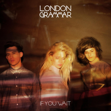
London Grammar
Band Inspiration

London Grammar are a British formed indie band by Hannah Reid, Dan Rothman and Dominic Major.
Their debut album If you wait was released 9th September 2013.
Tracklist:
1.Hey now
2.Stay awake
3.Shyer
4.Wasting my young years
5.Sights
6.Strong
7.NightCall
8.Metal & Dust
9.Interlude(Live)
10.Flickers
11.If you wait
12.Help
13.Darling are you gone leave me
14.Help me lose my mind
15.High Life
16.Maybe
17.When we were young
Indie Fashion moodboard

This mood board has inspired me by creating a clear image of what i want my model to wear and look like when it comes to shooting for my magazine. Indie fashion relies on looking independent and unique to someone else. I must create this image for my magazine.
Friday, 17 January 2014
Photographers
Terry Richardson

VIKTOR VAUTHIER

Viktor works mostly along side fashion. His images reflect this as they use fashion items in the photos. I like his pictures because of the fashion side. I could use his technique in my photography as the indie genre care about their fashion. His images are colorful which catches peoples eyes. This is also another technique that i could use on the cover of my magazine. The brighter the magazine is on the shelf the more attention it will get, enticing the reader to buy it. My favorite image from this moodbaord is the bottom left one, even though it is'nt bright but gloomy it still looks really good, it also has an element of indie in as she is wearing the cross. Her make up really stand out and the position of her hair creates a good picture.
MICHAEL THOMPSON

Like Viktors work Michael works with fashion, This would be useful for my magazine for the same reason. However his photographs are not in my genre of fashion and photography so his techniques wouldn't be suitable for my magazine. How ever i do like the second image along on the top row, it creates an element of innocence using the pale and pastel colour pallet, using a contrast of dark make up draws attention to her eyes
Tuesday, 14 January 2014
Prelim magazine

For my prelim magazine cover i chose to mimic a loud and quiet theme. This is for the simplistic and indie del to the magazine. The current fashion trend id leading edge so this would fit into what teenagers are looking for at school, therefore boosting sales in the magazine. The magazine would sell for 30p. The cheap price is reasonable, this meaning attracting people to buy it. The model i have used on the cover is the age in which would become the head girl of the school. By putting her on the cover as well people would start to recognise her.

For my contents page i chose to do it over a double page spread so i could include a large image of the new head girl looking quirky. I have stuck to the blue colour scheme for the contents title. I also included two different fonts to make the page look more interesting. By including the emails of different groups it attracts more people to join the teams of the media side of the college for people to gain experiences in their chosen areas.
Monday, 13 January 2014
CoverJunkie and Magpile Moodboard

I was drawn to the more artistic minimalistic covers on these sites. Bright colours caught my eye swell.
Magazine name
Awkward Magazine
I have chose this as a magazine title as it is associated with the awkwardness of choosing a genre of music to follow.
I have chose this as a magazine title as it is associated with the awkwardness of choosing a genre of music to follow.
Analysis of magazine covers
I have gone for quite a girly approach to looking at magian covers due to the colours used in them. When i come to designing my magazine cover i will take into consideration female and male audiences and the colours associated with these.
Double page spread analysis
After looking at a few double page spreads, i prefer the kaiser chief edition the best as it uses a picture across both pages where the other two tend not to do this.
Sunday, 12 January 2014
Contents page analysis
By doing an analysis of existing magazine contents pages this gives me a clear idea of what already works and what does not, it also helps inspire me for my magazine.
Magazine Covers
I am going to use these magazine covers as inspiration for the one I'm going to create. At this stage of the research my favourite layout is the I-D covers, they are simplistic but colourful.
Tuesday, 7 January 2014
Subscribe to:
Comments (Atom)