Friday, 4 April 2014

Draft evaluation- Q5

How did you attract/address you target audience?

Cover:

Masthead: The first thing people look for on a magazine is the mast head, as my genre was indie i wanted to create something unique and related to music as this was the main aspect of my magazine. When i constructed my draft cover i used the name "awkward" as it  fitted in with teenage life of choosing a group to be with. However after feedback i chose to use another name. After research i came across the musical term Octave, which i loved and it was related to music. So i used this instead. i feel the name attracts my genre as it is unique and no other magazine uses this. When designing the mast head i wanted to use a similar colour scheme to Q magazine however i didn't want to use the square they had used as i felt this wouldn't be unique enough for my genre. So i took the idea of the red as i felt this was eye catching to the audience. Seeing it put into practice by Q magazine i knew it would work.


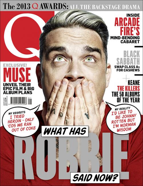
Main image/ model: The model i used on my front cover are of similar style to the genre i have selected to create my magazine for. My target audience would be interested straight away in regards to her style  and type of genre of music. This would add a unique selling point as 'Leading Edge' genre would be interested in as they can read fashion trends for their style. When i came to taking the photos i printed out a series of poses used on Q magazines front cover and asked my model to pose in this way. I wanted to use a similar pose to what Robbies edition used. The model is seen facing forward making eye contact with the reader. This invites the audience in to read the magazine and is also aesthetically pleasing. I used a plain background behind the model as this would make her the main focus on the cover and not the background. 

Cover Lines: I kept the idea of using the Q magazine colour scheme for my cover lines. I did this as i knew it already worked and the colours selected would catch peoples eyes when walking past the magazine stand. I looked at magazines already out there to get an idea where to place them and what to actually write. I chose to use the Exclusive cover line and this would intrigue the reader, as it is exclusive to Octave magazine. I chose to feature a cover line of my band/ artist 'Artificial Paradise' 'Naomi Edmonds' in red and white. The red contrasts to the black jacket, as does the white. Therefore bringing the readers eyes to this focal point. By putting the band name in a bigger font then the rest of the cover lines this will drew the reader in as the genre is indie and they want to look for new artists and bands all the time. 

Contents: For my contents page i chose to use the same model as i want the band to be the main focus of the magazine as they are new and upcoming. Again i chose to use Q magazines layout but change it by using different fonts for the main page title and then information about whats on the page underneath. This helps establish to the reader what they exactly are going to read. On the feature of my band i chose to use a white box that will stand out the writing therefore bringing the readers eyes to this point. 


DPS: Through the introductory paragraph on my double page spread i gave my readers a quick insight on what to expect when reading the article. I included a foot header at the top of the page in two different fonts which i used throughout the magazine, this makes it look interesting and adds some depth to the page. This idea came from Q magazine again. Other elements that i included from this magazine were the faded letter behind the text. This looks effective. When coming to put a photo on my double page i wanted to convey the artist as fun and loving life. I feel i achieved this through the picture i have used. 


Wednesday, 2 April 2014

Draft Evaluation- Q4

Who would be the audience for your media product?

My primary target audience would be both male and female 16years to 25 years old with an active interest in indie/ alternative music, fashion & British Culture. These were known as 'Leading Edge' taken from the research i conducted using the website 'UKTribes' as they want to be seen as unique and different to the rest. The listen to artists such as The Smiths, Vance Joy & Arctic Monkeys etc. They also love going to live gigs to spot the newest talent that they can share in their select group of other 'Leading Edge' people. I chose this age range as these are the people that love to go spot new artists and share them with their friends. Also the contents i have selected inside would be more suited to my chosen audience. The 'Leading Edge' Tribe love to shop in charity and vintage shops to get a look that is different yet sophisticated to their friends and peers around them. As they shop in charity shops and vintage shops this gigs them more money to buy the physical hard copies of the artists CD and to attend more live gigs as possible, so including this in my magazine was vital.

I reflected my target audience through the design I had chosen to use for my magazine. I used a similar colour scheme as Q magazine as i knew this had already worked. So recreating this meant my magazine could possible work with a professional feel to it. However, my magazine will not ignore the other age ranges as i know numerous people outside the age range that buy magazines such as Q magazine and NME

Other reading habits include Loud and Quiet, Q magazine, Worn, Document and V Magazine.

V Magazine

Document

WORN Fashion Journal


Draft evaluation-Q3

What kind of media institution might distribute your media product and why?

 The type of media institution that would be a likely candidate to publish Octave Magazine would be a company such as IPC media. The institution was founded in the UK in 1958 and has a large portfolio, selling over 350 million copies each year of magazines such as NME & Marie Claire. I feel that my magazine 'Octave' an indie music magazine including sub divisions of fashion and British Culture would fit great into this publishing company as it is yet to create a magazine like mine. As IPC is based in London this would be great for my magazine to be produced there as London is forefront of British music. In some aspects i can see my magazine fitting into the Southbank as it is an upmarket women's division of the brand including luxury fashion magazine Marie Claire. So this could help set my target market to women. However i do think they could work in hand with the division of IPC inspire's lifestyle brand as they already produce music magazine NME and could be a great source of inspiration for the magazine i am going to produce.

 When looking at NME  I decided that my magazine would be a similar price. My magazine would be displayed on shop shelves  and apeal to both male and female audience ranging from 16years to 25 years old. As there is is interest in NME  this means there would be possible interest for ym magazine meaning if the company were to invest into the magazine and start publishing they wouldn't be loosing profit on the magazine.

Thursday, 27 March 2014

Draft Evaluation plan- Q2

How does your media product represent particular social groups?


Comparing Naomi Edmonds (Left) to Hannah Reid from London Grammar

 My cover artist is shown through a close up on my magazine cover, Her hands are over her ears as this links into music and hearing. This pose was taken from an edition of Q magazine with Robbie on the front. The pose shows a silly , friendly side to my artist. These two characteristics are what i wanted to achieve from my artist. The indie genre are very conscious of their fashion sense, so by taking an outfit already worn by an indie artist this would be safe. I looked at pictures of Hannah Reid on Google and found the picture (Right) and liked the style of the leather jacket. I found out that my model/ artist had a similar one so i styled her in that. By using Hannah Reid as inspiration this meant i aimed the magazine at a younger teenage audience (16-20 year old) and could be both male and female as she is in a band with two males. 

 The artist I am comparing my artist too is also female, and in a band with two other males as opposed to being an individual artist. Both artists are lead singers in their bands. Even though I have used a female this does not mean i am aiming my magazine at just a female audience. By using a female artist this could also use the technique of a male gaze, and also as the artist is in a band with two other males creates an audience of both female and male. 

 Through my research of the artist, i have styled my costume around what they would wear. I have then combined this with my chosen photographer, Terry Richardson, and felt this has worked well into creating a professional shot. I selected a range of close ups, mid shots and long shots on a plain background similar to Terry Richardson. This helps the reader focus just on the artist and not the background of the magazine cover. 


Friday, 21 March 2014

Draft Evaluation- Q1

1. In what way does you media product use, develop or challenge forms and conventions of real media products?(I.e music magazines)


 For the title of my magazine I wanted to create something unique and linked to music, after doing research I came across Octave which is a musical term meaning a series of eight notes occupying the interval between two notes, one having twice of half the frequency of vibration of the other. I believe this matches the genre of my magazine because of the uniqueness, which is the main idea of being Indie.
 Conducting an audience research on UK tribes it gave me ideas for the clothing in which i needed my model to wear on the shoot and cover of the magazine. As the genre was indie and this is quite simplistic I felt that i didn't need to use any props, however i chose for my model to wear a leather jacket, this is in my genres everyday clothes.
 As part of my research i looked at different photographers that I could mimic their work. After the research I looked at which one would be more suited, Terry Richardson's work used an over exposure and silly, fun poses. I wanted to convey this idea in my final product, Terry used mid shots of the people he is using, most magazines use the mid shot to get a clear image of the artist. I took this into consideration and did the same as I felt this would be best.
 After looking at magazines that i liked, i came across Q magazine that used quite a simple layout and colour scheme. The red square with the 'Q' was eye catching, however i didn't want to copy another magazine out there, so instead i chose to use the whole of my title name in red. I feel like this was the best option as its simple but the red would catch peoples eyes on the shelf. The font i used for the title was penelope anne. This was different to the research i had conducted, this was because i found a internet site called dafont and realised you could download fonts from there.


 My model used a similar pose to Robbie's edition on 'Q' magazine. The pose was silly and unique and this is what i wanted my magazine to be like. I chose to use the bar at the top of my magazine as many magazines done do this. Other elements i used from this addition are the red, grey and black colour scheme. However, i chose to do only one side of the contents of the edition as this is where most people would look first when the magazine is picked up. 

My double page spread also uses the same context as Q magazine with the letter behind the text. I chose to use this as i already knew it worked this would create a successful magazine. 

Thursday, 6 March 2014

Possible Pictures for my Cover


I feel that my second photo shoot went more successful, this is because i have got feedback on my other photographs and know what i needed to improve on. This made it easier for me to produce something that people liked. 

 I have chose this as potential photos for my front cover as they are exposing the artist to the camera, this was due to my feedback asking for the artist to be facing forward. After putting the feedback into action i now prefer a forward pose, because the artist is new so you will want to show the audience of the magazine what they look like.